Top Banner Advertising Cases
In our previous article, we explained what crypto advertising actually is and how it works. We also described the most effective banner sizes. Today we talk about the best banner advertising cases in general.
TOP-15 best banner ads cases
- Pottery Barn
- Bloods
- SEMRush
- Chevy
- The New Yorker
- AT&T
- Best Buy
- Coca-Cola
- Conversica
- E*Trade
- Dale Carnegie Training
- Instapage
- Lendingtree
- Poleyes
- Shutterfly
Pottery Barn
The Pottery Barn desk ad is an excellent example. A high-quality photo is being used to emphasize the usefulness of the tables. One can see how effortlessly the table furniture can blend into the room. Together with a logotype, an engaging call to action, and a straightforward layout, it all works effectively. Whether all browsing Amazon or a designer setting up their home office, this advert would be the perfect means of satisfying the requirements.
Blue Bloods
A banner ad by CBS on one of their programs has a terrific CTA. “Try 1 Week Free” draws audiences to test their new streaming service CBS All Access. The use of the program, an already popular one, and the option to view all the shows in the live streaming mode appeal to viewers. This advertisement also features the show’s logo and celebrity. In combination, it provides viewers with all the information they need without seeming overwhelming.

SEMrush
SEMrush, a popular SEO extension, has used a small square banner that is not only user-friendly but also beneficial for advertisements. That doesn’t need a lot of detail to get the message across. With this ad, SEMrush gives you a sense of precisely what provision their product service offers in under 20 words. UX, SEO, Time, and Page Speed keywords are the most important. Here effectively captures the attention of businesses wanting to enhance their metrics.
Chevy
Giving all the technical specifications of a vehicle on a billboard is impossible unless the ad looks overwhelming. Chevy chose to play with text to make sure the message wasn’t overloaded. Furthermore, they selected important information and language to make certain that the exposure would be high. Chevy also made emphasis on incorporating color within the most relevant texts. The rebate for this product and the CTA are highlighted in yellow, drawing direct attention to these two advertising items.

The New Yorker
The New Yorker takes minimality a long way, and it knows it. The New Yorker takes a promotion where you can receive a free cloth tote bag when you sign up for the store. Picture of both is an excellent way to exploit figurativeness, and pricing is bolded out here to indicate its value.

AT&T
Everyday advertising usually concentrates on everyday and necessary things. As for AT&T, their advertising piques curiosity and gently compels the consumer to take the next purchase action.
Best Buy
Everyone strives to provide comfort and convenience. Specialists are increasingly working on applications that automate processes and make life easier for users. So Best Buy is a specialist in banner advertising. They knew exactly the obstacle one can face when buying a phone online from Best Buy. It is primarily the need to activate it in-store.
Nevertheless, in their advertisement, they assure their readers that there is no need to activate the phone. What are they offering customers? They show that buying from them will be convenient and won’t cause any unnecessary hassle. This is important when people are busy avoiding frantic holiday shopping.
Coca-Cola
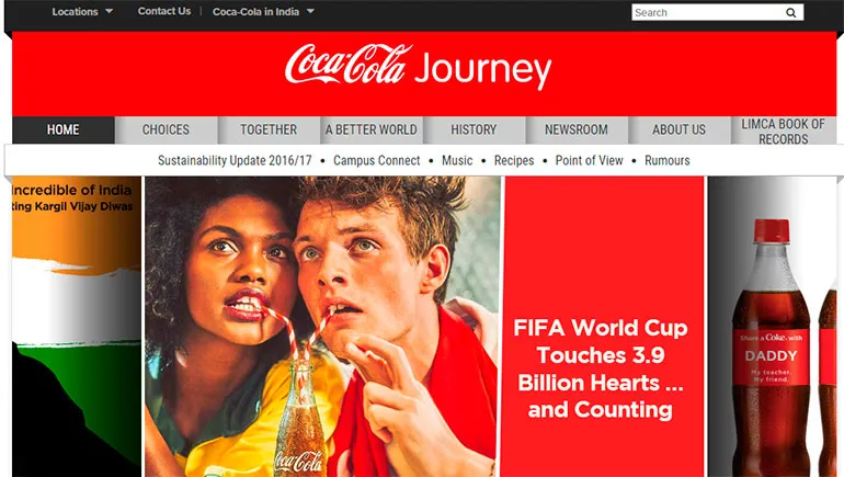
This commercial shows its partnership with the NFL team, by positioning the drink as the perfect game-day choice. Here are two things particularly striking in this ad:
- There is a casual usage of the product placement of Coca-Cola in the visuals.
- The suggestion is not a sellable ‘Buy it now, but more of an invitation to get some benefit from the Coca-Cola homepage.
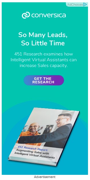
Conversica
By offering something of value, Conversica positions the talk around how they can help. This focuses on the customer’s requirements, not on sales.
Dale Carnegie Training
It’s an advertisement that works extremely well with a small presentation format. Also, the ad uses your existing Dale Carnegie name brand recognition to deliver a powerful statement, which boils right down to “Learning from the best in the business“.
E*TRADE
This ad’s bold tone goes well together with its bold claim. Through copywriting in this advert, E*TRADE cuts through the clutter by stating, “If you open an account with us, you’ll get a certain amount without risk or commission.” The effect is to make it appear as if it is an inc bargain.

Instapage
This banner’s genius is its simplicity. Instapage gives a daring declaration that piques curiosity and then offers the user an endorsement of why it’s awesome. They also make it in a nutshell, which enables the use of clean, daring typography and artwork.
Lendingtree
Sometimes, banner ads can even include animation and interaction. What Lendingtree takes to its advantage is the inclusion of a button slider that the consumer can use to compute the mortgage amount. Having a push button then directs him to the next stage – namely clicking on the advert and taking him to their website. There is utility in the ad, which is the reason it’s so impactful.
Popeyes
And the idea that people simply don’t notice advertising anymore is a real issue. Popeyes makes good use of warm and cool color contrasts coupled with big, bold typefaces. Putting the food in the middle draws the eye in and allows the image to talk for its own sake.
Shutterfly
Since people often like the coupon system, this type of advertising has securely carved out a niche for itself. For example, you can simply sell festive items and save cash in the process. It’s a simple message in advertising, but stunningly effective.
Even if this was new information to you, you have probably encountered banner advertising and are unknowingly aware of it. But the secret is that this detail greatly increases sales and establishes good communication with your audience.
So by having the right promotion strategy and combining this with quality advertising you will be building your ideal business in a new way.
Some other top examples of online banner advertising:
- Amazon – “Shop Now” banner ads: Amazon’s banner ads are a prime example of effective online advertising. The ads feature clear calls to action, dynamic product images, and enticing offers to encourage visitors to click and start shopping.
- Spotify – “Premium for Students” banner ads: Spotify’s banner ads targeting students effectively use bright colors, playful graphics, and a compelling offer to attract attention and encourage sign-ups for their premium service.
- Airbnb – “Live There” banner ads: Airbnb’s banner ads feature stunning images of unique travel destinations, combined with a clear and concise message to encourage visitors to explore and book their next adventure.
- Squarespace – “Build a Website” banner ads: Squarespace’s banner ads use simple and bold graphics, combined with a clear call to action to encourage visitors to build their own website using their platform.
- Grammarly – “Grammar Checker” banner ads: Grammarly’s banner ads target writers and professionals, using clear messaging and examples to highlight the benefits of their grammar-checking software.
Final words
So, as you can see, the key to a successful advertising campaign is choosing the right banner format, as well as the optimal banner size.
It is important to understand that in order to attract a discerning user, it is necessary to visually interest him. It is worth carefully considering the text part of the advertising banner, as well as testing different banner formats – changing colors, making accents, as, for example, did SEMrush (#3). By the way, numbers always attract more attention than just text. Pay attention to the Chevy (#4). Agree, the numbers immediately stand out against the background of text ads.
Previously, we wrote about the most effective sizes of banners for crypto advertising, and you have already read about targeting strategies for crypto display ads.
Bitmedia is a crypto advertising network that provides the most effective advertising campaigns. Our account managers will help with setting up targeting, and geo and our designers will make banners for your campaign for free!
Choose Bitmedia!